
Brand & landing page · Parody
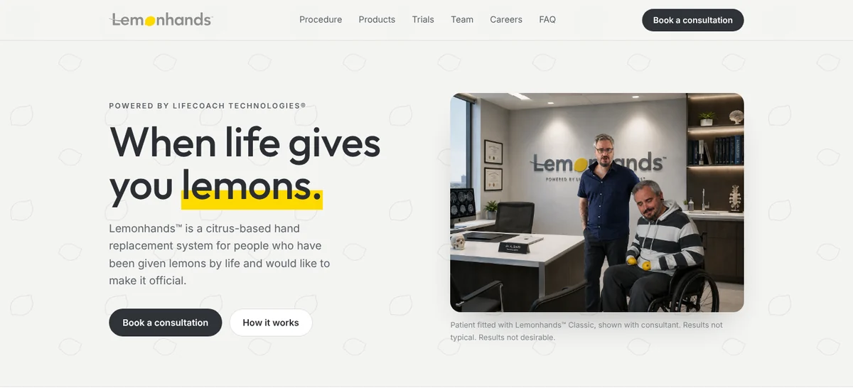
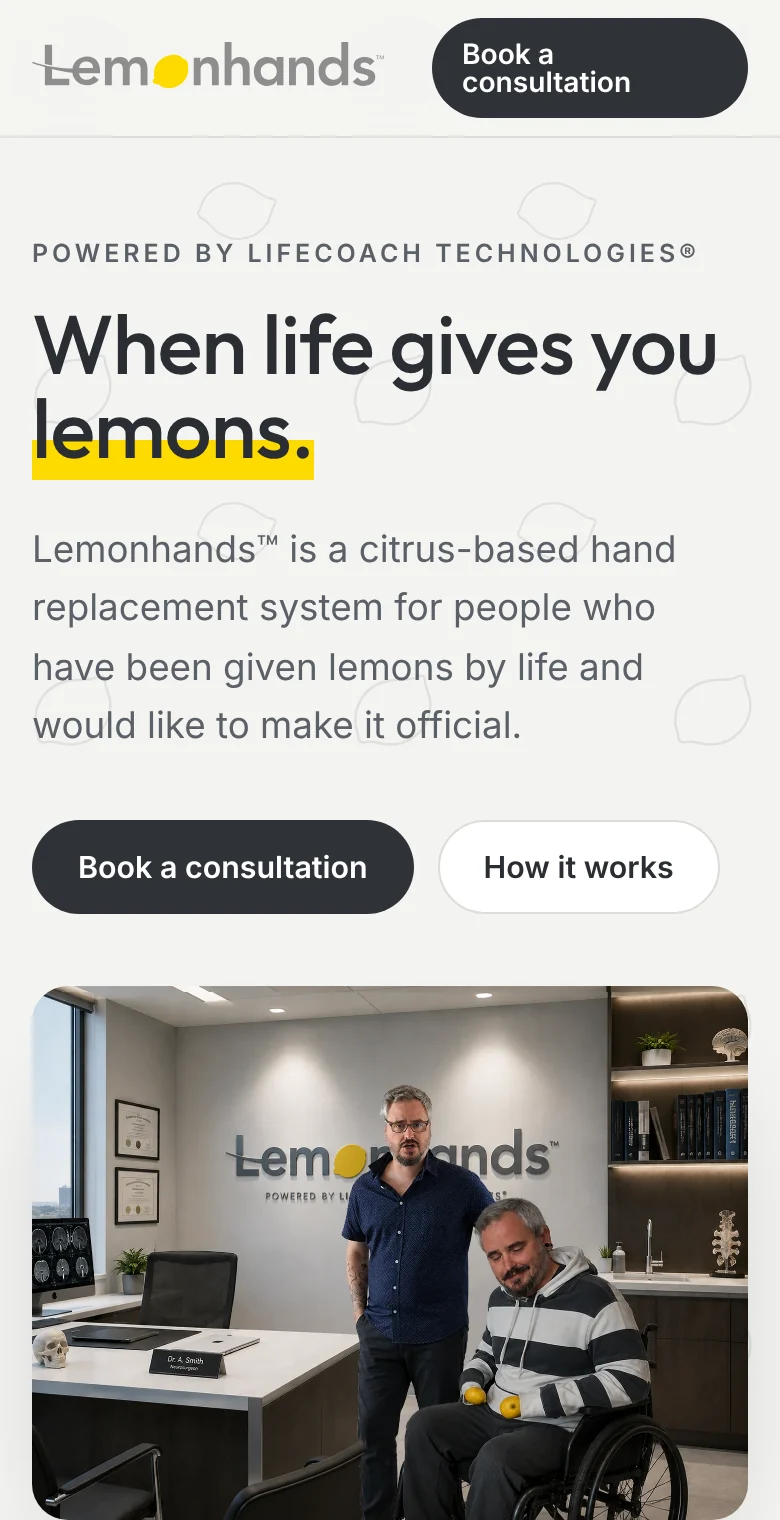
When life gives you lemons.
A citrus-based hand replacement system, for people who have been given lemons by life and would like to make it official. A made-up brand with a straight face: a clinical identity, a deadpan voice, and a landing page that sells it properly.
The idea
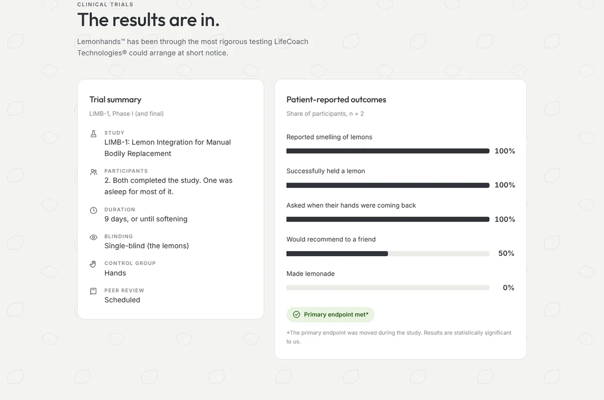
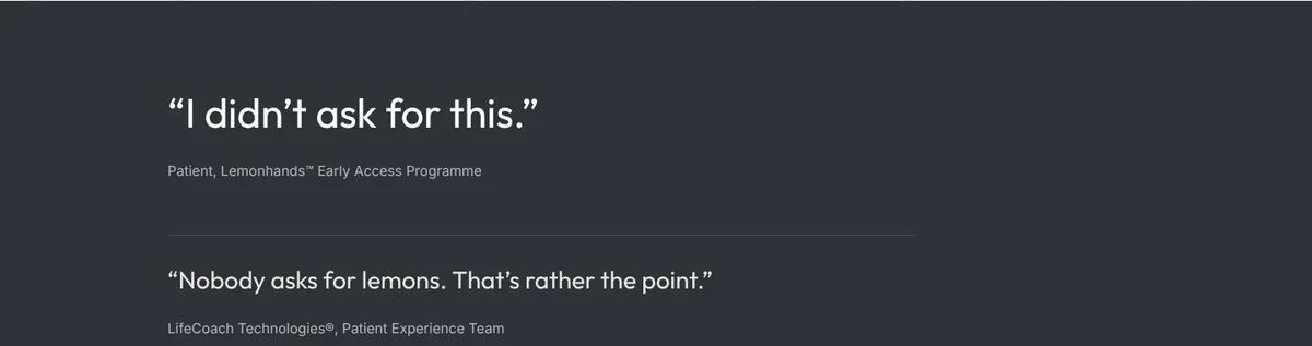
The joke only works if nobody in the room laughs. So the brand plays it completely straight: calm clinical language, a three-step process, a pricing table, patient stories and a testimonial wall for a product that is, plainly, a lemon.
The creative direction was to borrow everything people trust in healthcare branding (white space, soft greys, a single warm accent) and let the absurd product do the rest.
The logo
Calm and clean
A friendly geometric sans in a quiet mid-grey (#8E8E8E). Nothing shouts, so the lemon does the talking.
A lemon for the “o”
A slightly lumpy, hand-drawn lemon with a nub at each end, in bright #FEDA00. It is the only colour in the mark.
One stroke through the L
A thin arc sweeps in from the left, crosses the L and settles under the e. It adds a little movement to an otherwise still word.
The straight-faced line
Wide-spaced light capitals with LIFECOACH picked out in bold, so it reads as a parent company at a glance.
Room to breathe
Keep a margin of at least one lemon (x) on every side. No text, edges or images inside it.
Never smaller than this
Below 140 px wide the endorsement line stops being legible. Use the lemon on its own from 16 px down.
Colour
Website
Type
Icons
A set of 16 simple line icons for the site: hand, lemon, shield, flask and so on. One weight, round ends and corners, no fill, so they read as calm medical pictograms and carry the deadpan tone.
The site
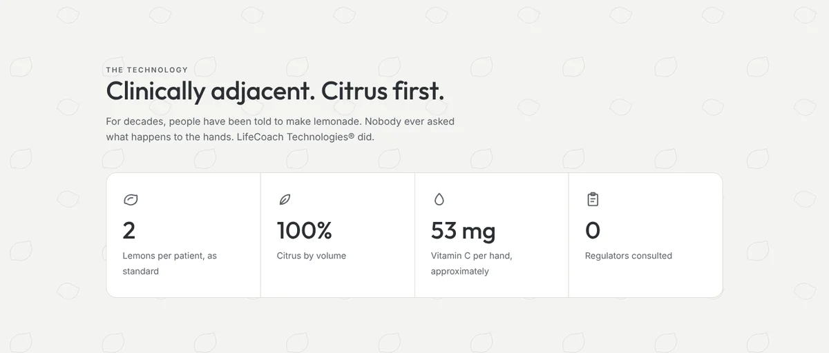
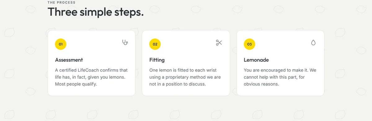
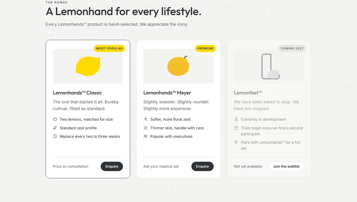
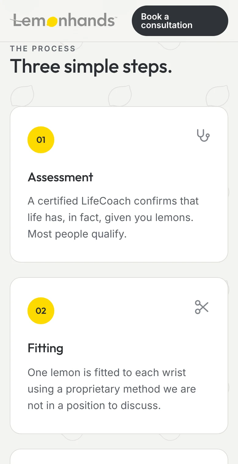
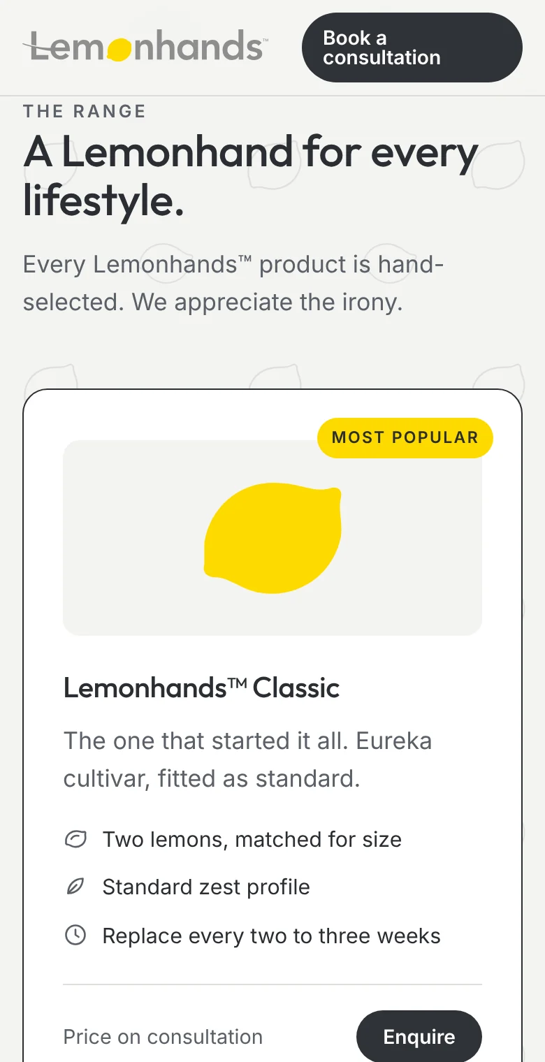
A single long page that moves like a clinic brochure: the problem, the technology, a three-step process (assessment, fitting, lemonade), transparent pricing, a range of products, and results from happy patients. Every section is written with the same flat, reassuring confidence.
Selected moments
On a phone
See it in full
The whole landing page, as a visitor would see it.
Visit the site → Opens lemonhands.waltviviers.com