Brand identity & label design
One brewery, three beers.
Longhouse Brewery is a brewery in Johannesburg. I designed the whole look: the brewery seal, three beer labels with their own illustrations, and the rune-style lettering that ties them together.
The idea
One seal. Three characters.
The brewery seal is the constant. A longhouse roof, rune-style lettering and three small crosses sit inside a plain circle, and it sits at the top of every label, so the brand is recognised before the beer is.
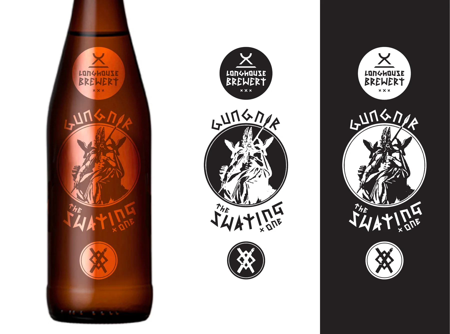
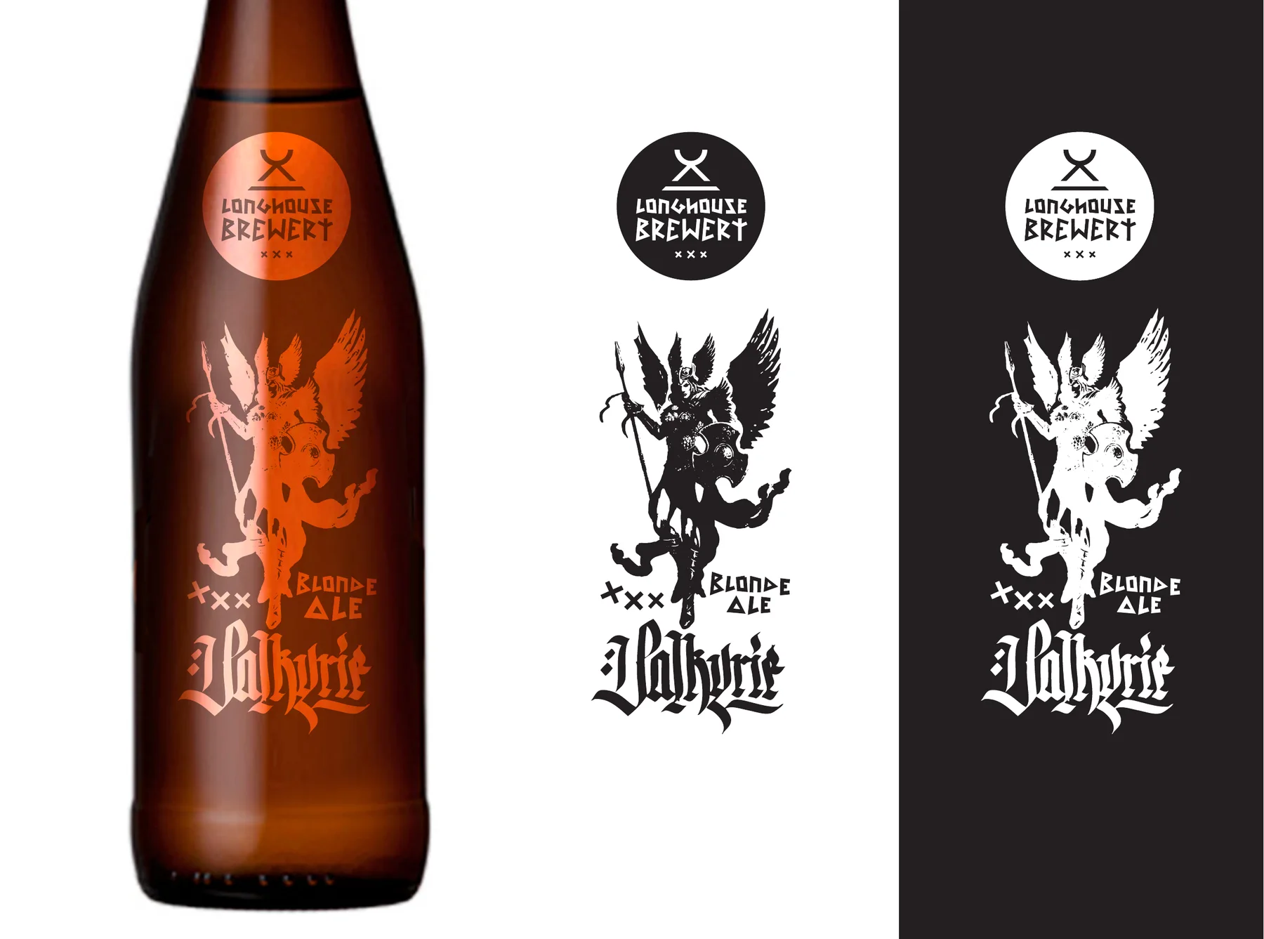
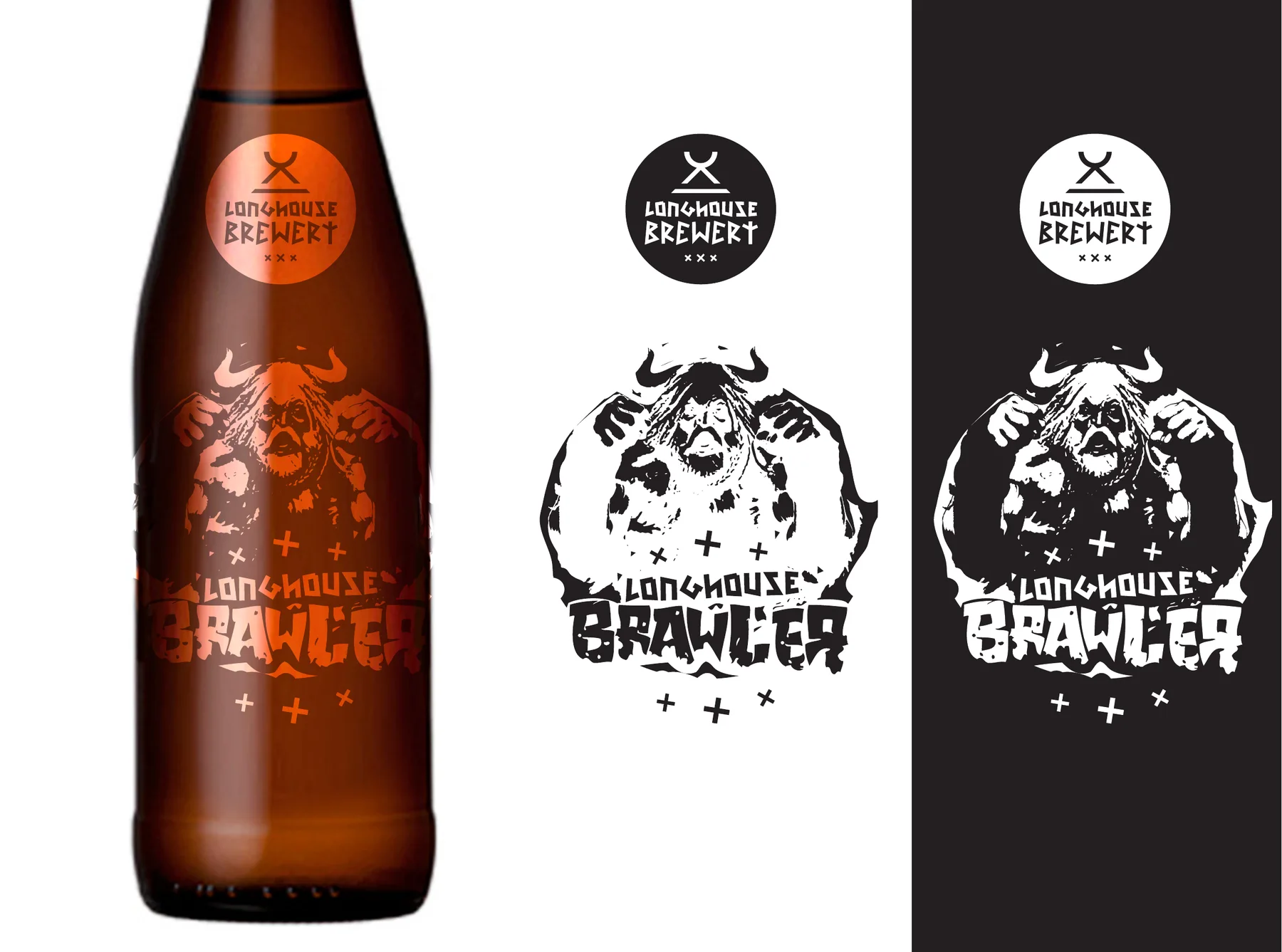
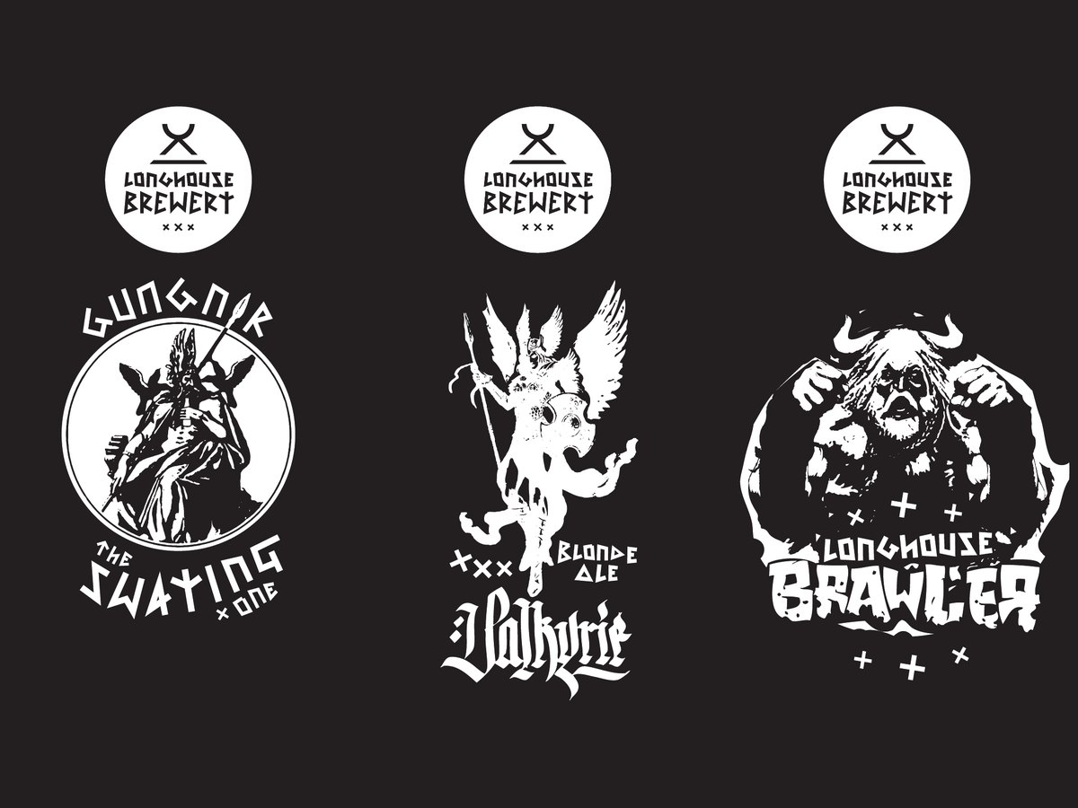
Under the seal, each beer gets its own illustration and lettering. Gungnir is a calm, framed portrait. Valkyrie is light and winged, with blackletter script. Brawler is rough, heavy and stamped. Three personalities, one family.
What makes it work
A seal that stays put
The round Longhouse mark sits in the same place on every bottle, so a row of beers looks like one brand.
Rune-style lettering
Angular, hand-drawn letters give the brewery its Norse voice and set it apart from a typeface on a shelf.
One colour, many finishes
Every piece of artwork is drawn to work in a single colour, so it holds up in black, in white and as copper foil on glass.
A clear back label
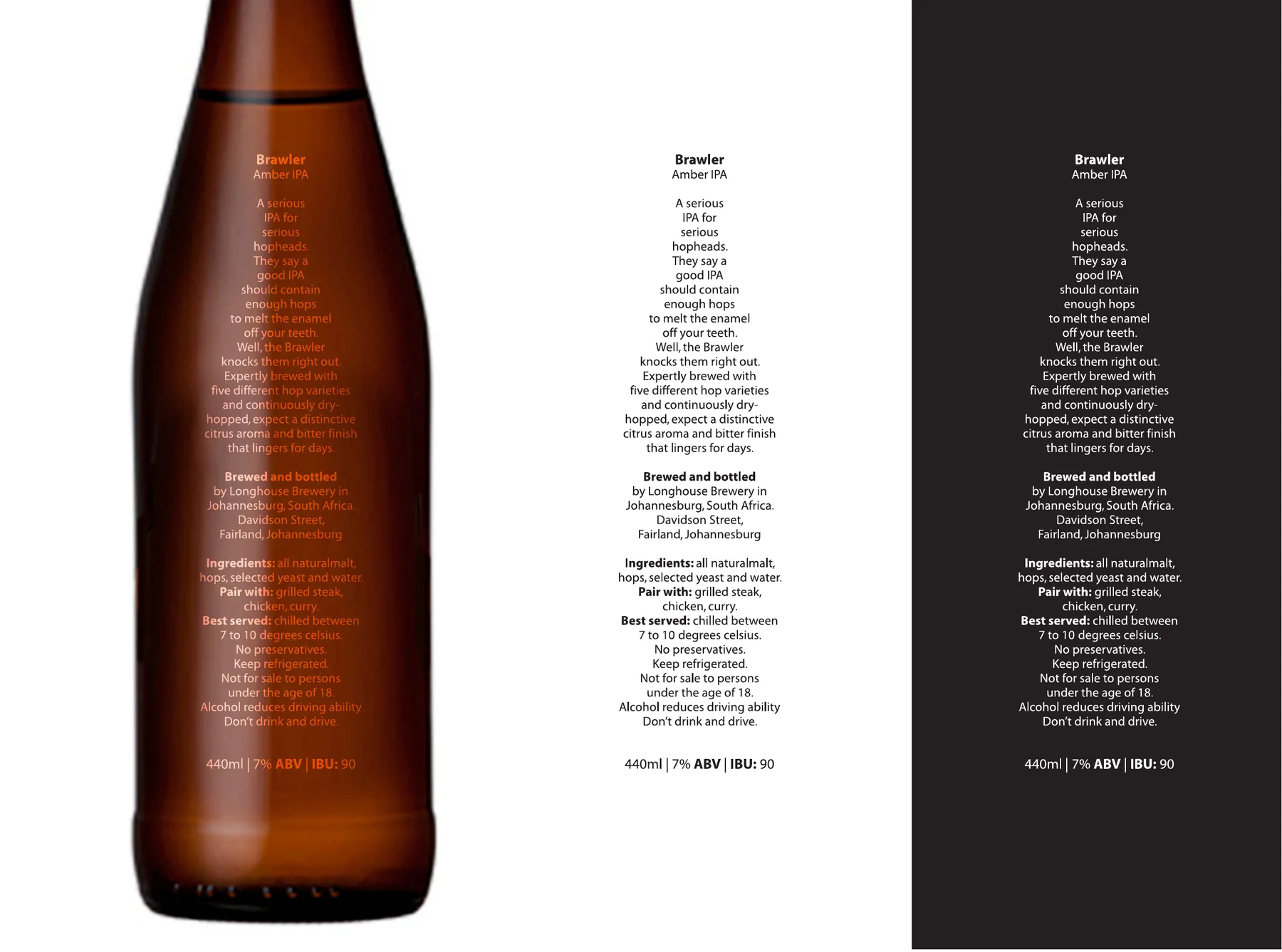
Name, style, tasting note, ingredients, pairing, serving temperature, strength and bitterness, set simply so it reads at a glance.
Colour
The beers
Gungnir, Valkyrie and Brawler.
Each label, shown as copper foil on the bottle, then in black on white and in white on black.