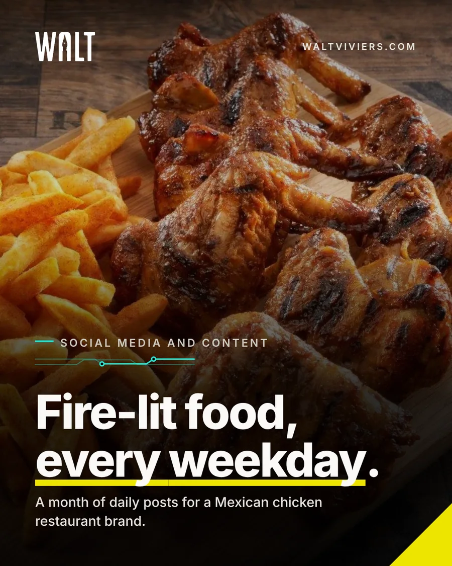
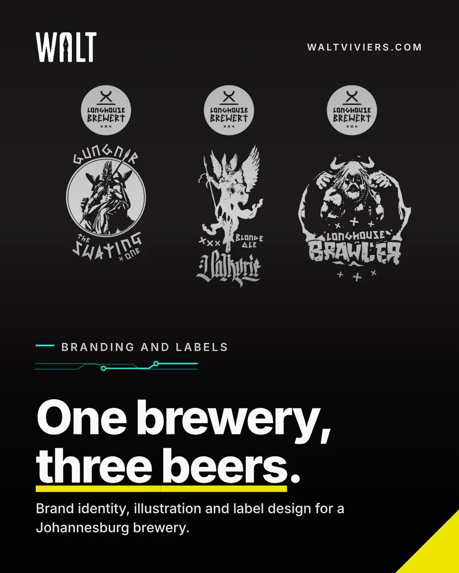
Personal brand & social identity
My own brand, made to ship.
WALT is the name and the look behind everything I make. A pen-nib wordmark, a small set of shapes and colours, and the covers, cards and posts that carry them across every place people find me.
The idea
One name. One look. Every place.
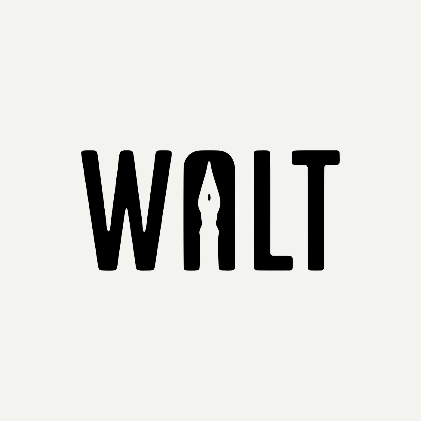
I do design, art, photography and creative consulting, and they can look like four different people. The WALT brand ties them together. The wordmark carries a pen nib in the A, so it says "made by hand" before anyone reads a word.
Around it sit a few repeating pieces: a yellow underline on the key words, a notched corner, and a thin teal circuit line. They show up on every cover, card and post, so a visitor knows it is me before they see my name.
What makes it work
A wordmark with a nib
Heavy, simple letters with a pen nib cut into the A. It reads at a glance, even small in a profile picture.
Yellow for emphasis
One yellow underline marks the idea in every headline. White text on dark keeps it easy to read on any screen.
Cut corners
Buttons, cards and covers share a notched corner, a quiet nod to a cut sheet of paper and a circuit board.
Circuit lines
A thin teal line with two nodes sits above the small label on each piece. It links the creative side with the technical side of my work.
Colour

Covers
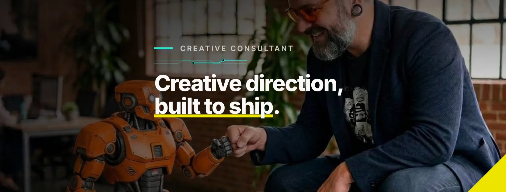
One system, every platform.
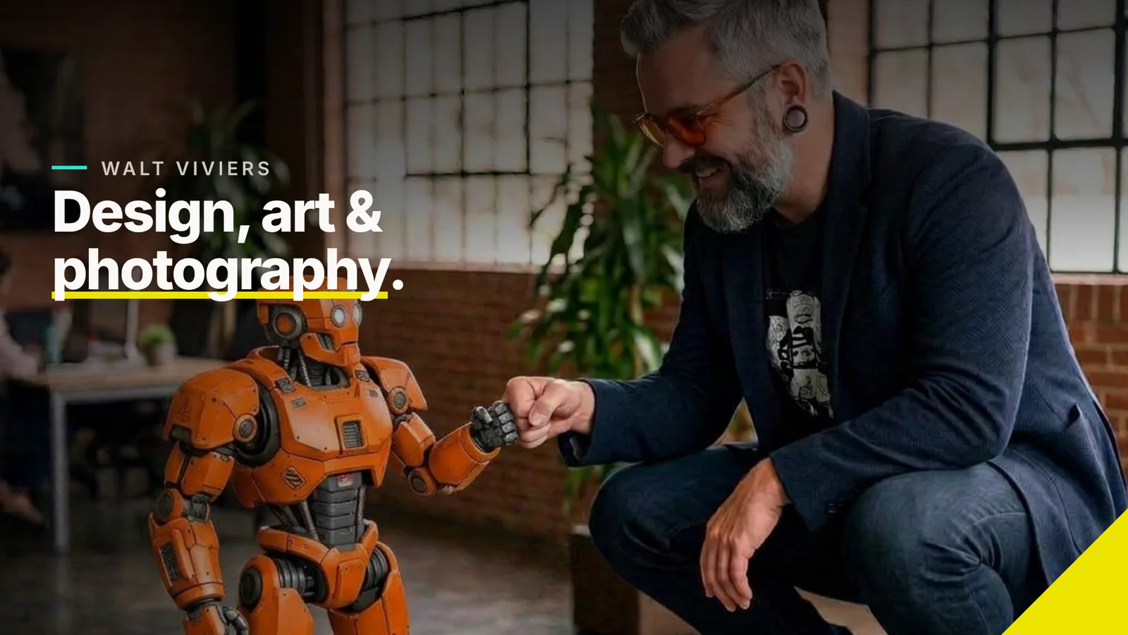
The same layout is reshaped for each cover: a headline with the yellow underline, a small label with the circuit line, and the notched corner at the bottom right.

Catalogue
Four cards, four services.
Each WhatsApp catalogue card names one thing I do in a single line, using the same layout, so the catalogue reads as one set.


Posts
Cards that show the work.
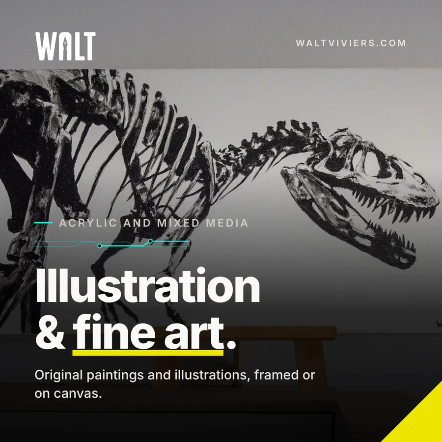
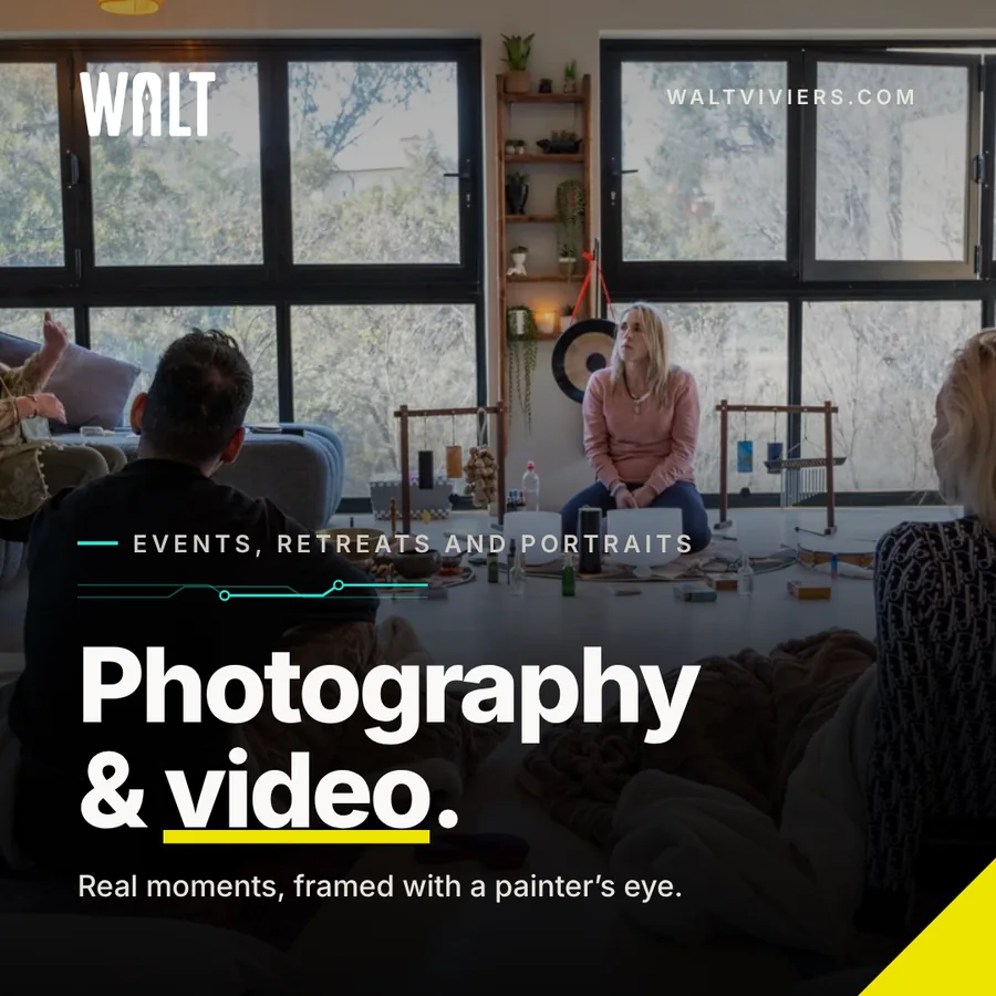
A card template turns a project into a post. Each one pairs the work with a short headline and the same corner and underline, so the feed looks like one brand.